Animated balance beam showing the mean as a balance point.
Our topic for this chapter is central tendency, or figuring out what a typical score in a distribution looks like. There are three measures of central tendency we’ll cover: the mode, the median, and the mean. Some or all of this will most likely be familiar to you already. But it’s important that we understand conceptually what each of these measures represents and what situations make each one more or less appropriate for our purposes.
What is central tendency?
Generally speaking, what we want from a measure of central tendency is a single value to help us describe and summarize a set of data. In the questions below, don’t worry about remembering statistical specifics. I just want you to try to start from scratch and explain what seems a sensible approach in each case. What kind of score is most central, or typical, or representative in some way?
Finding the center
0 of 4
1
Suppose the children in two preschool classes were asked to choose
their favorite color from blue, pink, red, and green. If you had to
choose one response to represent each class, which would you choose?
Does your choice represent both classes equally well?
Preschool class A: 18 children chose blue, 5 chose pink, 4 chose red,
and 3 chose green.
Preschool class B: 9 children chose blue, 8 chose pink, 7 chose red, and
6 chose green.
Hint
Compare the tallest bar with the second-tallest bar in each
class.
Answer
Blue is the most common response in both classes. But it represents
class A much better: 18 of the 30 children chose it, while in class B it
finished only one vote ahead of pink.
Explanation
Choosing one category hides how decisive that choice was. Class A has
a clear favorite; class B is much more evenly divided. A single summary
can be accurate while still leaving out something useful about the
group.
2
Suppose these are the final letter grades for a class. If you had to
choose one grade to summarize the class, which would you choose? Unlike
colors, grades can be put in order. Does that give you another sensible
answer?
Final letter grades from F through A: 1 student each received F, D, and
C, 2 received B, and 4 received A.
Hint
Imagine writing down one grade for each student and arranging all
nine grades from F through A.
Answer
A is the most common grade, so that is one sensible answer. But B
falls halfway through the ordered grades: 3 students received a lower
grade and 4 received a higher grade, with the 2 Bs spanning the middle
of the list. So A captures the peak of the distribution, while B
captures its middle position.
Explanation
The new ingredient here is order. Favorite colors could only be
counted, but grades can also be lined up. That makes a second kind of
center possible, and the two answers need not agree.
3
Suppose these are scores on a test out of 10. Which number would you
choose to represent the center of the scores? Can you find more than one
reason for choosing it?
Sixteen test scores form a symmetrical distribution centered at 5. For
scores 2 through 8, the frequencies are 1, 2, 3, 4, 3, 2, and 1.
Hint
Try three approaches: find the tallest bar, count in from the two
ends, and compare scores the same distance below and above 5.
Answer
A score of 5 is the natural choice. It occurs most often, it falls
halfway through the ordered scores, and the scores balance symmetrically
around it.
4
Here is a more complicated-looking distribution. Would a single
number give a useful description of its center? What would it capture or
hide? Would one typical score or more than one be most useful?
A histogram labeled Score and Frequency, with two unequal peaks and
observations spread through the valley between them.
Hint
Compare a value in the valley between the peaks with one value near
each peak. What does each description preserve or hide?
Explanation
There isn’t one required response. The larger peak captures where
scores occur most often. A value between the peaks describes the
distribution’s overall location, but falls in a valley containing
relatively few scores. Two values, one near each peak, better preserve
where the scores cluster. The useful choice depends on what we want the
summary to represent.
Quiz 3.1
In working through those examples, you probably found yourself using a few different ideas about what a useful summary should do. Each example changed what kind of information was available. Favorite colors could be counted. Letter grades might also be put in order. Numerical scores had meaningful distances between them, which made it possible to think about balance as well. And the two-peaked distribution showed a difficulty we can run into: reducing a distribution to one value inevitably leaves something out. Sometimes we might need more than one.
Putting the terminology from Chapter 1 onto those examples, favorite color is a nominal categorical variable, letter grade is an ordinal categorical variable, and test score is quantitative. Those distinctions lead to the three approaches we’ll focus on:
Table 3.1: The mode, median, and mean answer different questions and require different kinds of information.
Measure
Question
Information required
Works with
Mode
What occurs most often?
Category membership and frequency
Nominal, ordinal, or quantitative data
Median
What lies halfway through the ordered observations?
Order
Ordinal or quantitative data
Mean
Where do the numerical values balance?
Numerical magnitudes and meaningful distances
Quantitative data only
So the mode, median, and mean offer distinct definitions of central tendency. They have different requirements of the data and answer different questions. For some kinds of data we can use more than one measure; we might find they give similar answers, or that their answers diverge. That doesn’t make one inherently better than another. We need to look at each measure in a bit more detail to drill into what each one is capable of and when they are more or less useful.
The mode
The mode answers a simple question: what happened the most? More technically, the value of the mode is the category or score with the highest frequency. If we’re looking at histograms or bar charts or whatever, the mode is generally the tallest bar. In a frequency table, it’s the row with the highest frequency.
The mode is generally most useful with categorical data, either nominal or ordinal. In the kids’ favorite colors example from Quiz 3.1, blue was the mode for both classes. But in the second class it was only just ahead of the other colors. It’s true to call blue the mode for both classes, but it is a relatively less useful description of the data from class B. Depending on our purposes, we might want to think of that class’s data as not having a clear mode—which is still a useful description. With the letter grades example (an ordinal variable) the mode was an A grade. No problem there (though as we’ll see the median gives a different answer).
The mode can also be determined for quantitative data. But just because we can doesn’t mean we should. Whether it is useful depends on the range of the scores and what values are possible. Say we have a discrete quantitative variable like the data represented in the third quiz question. The values represented scores on a ten-question test. Here’s that data again in the form of a frequency table:
Table 3.2: A simple frequency table for the test scores from the opening quiz. The mode is 5.
Score
\(f\)
0
0
1
0
2
1
3
2
4
3
5
4
6
3
7
2
8
1
9
0
10
0
Both from the histogram in Quiz 3.1 and the frequency table above, we can see that the mode is 5. Very straightforward.
But what if the test had a hundred questions rather than ten, and the data were evenly spread across the 0–100 range of possible scores? We saw an example of this situation in Chapter 2. We would have a table with many rows, most of which would have a frequency of zero or one, and we wouldn’t be able to extract a useful mode. One way around this problem is to find the mode for a grouped version of the data rather than the raw scores. Following the rules of thumb we laid out in Chapter 2, we could group the scores into bins, like 0 through 9, 10 through 19, and so on. Then we could make a grouped frequency table:
Table 3.3: Grouped frequency table
Score bin
\(f\)
0–9
4
10–19
4
20–29
5
30–39
7
40–49
10
50–59
18
60–69
11
70–79
7
80–89
5
90–99
2
Now we can easily identify the modal bin. Like we mentioned in our discussion of grouped frequency in Chapter 2, grouping the scores discards information. We can’t tell what exact score was the most common, only which bin contained the most scores. Here the modal bin is 50 through 59, but we don’t know what score or scores were the most common within that range. And bear in mind that the grouping in Table 3.3 is not the only way to group those scores; a different choice of bin width or cut points would give us a different modal bin.
Regrouping the same observations
0 of 2
1
Here are the same observations regrouped into bins 20 points wide
instead of 10.
Score bin
\(f\)
0–19
8
20–39
12
40–59
28
60–79
18
80–99
7
How many observations are represented in total? (i.e. what is the
sample size, \(n\)?)
Hint
Each observation belongs to exactly one bin. Add the frequencies in
the \(f\) column.
Answer
73
Explanation
Each observation is counted once in one bin, so adding the
frequencies gives \(8 + 12 + 28 + 18 + 7 =
73\). Regrouping changes how the observations are arranged in the
table, but it does not change how many there are. If we treat them as a
sample, its sample size is \(n =
73\).
2
Which statement best compares this grouped table with the original table?
Answer
The modal bin changes to 40–59, but the exact mode is still
unknown
Explanation
Combining adjacent rows of the original table gives frequencies of 8,
12, 28, 18, and 7. So with the wider bins, 40–59 is the modal bin. The
underlying observations have not changed, only how they are grouped. And
we still do not know how the 28 observations are divided among the exact
scores from 40 through 59, so we cannot identify the exact mode.
Multiple modes
The other thing worth mentioning is that a set of data can have more than one mode. If two exact values tie for the highest frequency, both are modes. More broadly, we can describe a distribution as bimodal or multimodal when its frequencies form two or more distinct peaks, even if the peaks are not exactly the same height.
Remember the last distribution from Quiz 3.1? It actually comes from a perceptual psychology study. Researchers wanted to know how well people could discriminate between major and minor musical modes. They created “tone-scrambles”: 32 musical notes played rapid fire over the course of two seconds in random order, creating an effect, according to the researchers’ evocative description, “akin to alien birdsong.” One of these weird birds tweeted major thirds while the other presumably more melancholy bird tweeted minor thirds. Listeners classified each scramble as one type or the other, and the researchers measured the proportion they classified correctly (Chubb et al., 2013).
The graph in Figure 3.1 shows a distribution that goes up and down and up again in two waves. There’s one peak close to 0.5, which is what you would see if people were just guessing. And another peak near 1, or nearly perfect performance. The researchers took this as evidence that the task sorted listeners fairly cleanly into a group with little sensitivity to the difference (performing close to chance) and another with high sensitivity.
Figure 3.1: Distribution of proportion correct in the test phase across 275 listeners, pooled across three tone-scramble experiments. Recreated from Chubb et al. (2013), Figure 6.
Histogram of proportion correct for 275 listeners. One peak is near chance performance at 0.5 and another is near perfect performance at 1.0, with fewer listeners between them.
This is a difference between the mode and the median or the mean. We wouldn’t usually talk about a distribution as having two means or two medians. But we can talk about a distribution as being bimodal or even multimodal if that seems a useful description.
The median
While the mode focuses on frequency—what happened most often?—the median focuses on order; if we put our data in order from smallest to largest, what value splits the observations in the middle? So the mode is just the most common, but the median starts to put the “center” in central tendency.
The median is also called the 50th percentile. Since it is the middle position of the ordered data, at least half (i.e., 50%) of the observations are at or below the median, and at least half are at or above it. (The “at least” qualifier is important, because as we’ll see, multiple observations can have the same value as the median, meaning the at-or-below and at-or-above groups overlap.)
Since it requires a meaningful order, the median doesn’t work with a purely nominal categorical variable. We couldn’t find the median favorite color, for example. But it can be used with ordinal variables. Let’s work through finding the median for the ordinal letter-grade data in the quiz at the start of the chapter.
Activity 3.1: Find the median grade
Letter grades are ordered to find the median in odd- and even-sized sets, including a case where the middle falls between C and B.
The median works the same way with quantitative data, since numerical scores have an inherent order. Take the symmetrical distribution of test scores from the third quiz question:
Figure 3.2: The sixteen test scores from the opening quiz, arranged in order.
Sixteen ordered test scores: 2; two 3s; three 4s; four 5s; three 6s; two 7s; and 8. The two middle scores are both 5, so the median is 5.
5 was the most common score, making it the mode. There are an even number of observations, so there are two middle positions: the eighth and ninth. Both contain 5, making the median 5 as well. So in this case, the mode and median point to the same place. (As we saw in Activity 3.1, this agreement is not inevitable.)
What about when we have an even number of scores? That posed a slight problem for ordinal data, but if the variable is quantitative, no problem at all: we take the point halfway between the two middle values. That’s a meaningful value for the median since on a quantitative scale the distances between numbers are all consistent (unlike the distances between ordinal categories).
Figure 3.3: Four quantitative scores with a median of 75, halfway between the two middle scores.
Four ordered quantitative scores: 65, 70, 80, and 90. The median is 75, halfway between the two middle scores.
Median and ordinal data
Six customers give ordered satisfaction responses. The two middle
responses are neutral and satisfied. What is the most appropriate way to
describe the median?
Answer
Between neutral and satisfied
Explanation
The responses can be ordered, so their middle positions are
meaningful even though the variable is categorical. But there is no
defined halfway amount between neutral and satisfied: averaging category
codes would assume equal gaps. Any convention for resolving that
boundary should be stated.
The mean
The mean, or average, is more nuanced because it uses every numerical value, not only their ordered positions. To calculate it, we add all the scores and then divide by the number of scores. This might seem like a simple idea, and we’ll soon see what’s so elegant and useful about it. But it took a long time to catch on. It’s worth taking a brief historical tour of the idea to get a sense of its uses (and abuses).
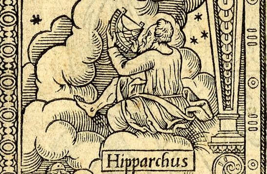
Averaging, as a mathematical idea, has been around for a long time. The Pythagoreans discussed it in the third century BCE, but in the context of musical theory rather than data analysis. You would think scientists whose job involves taking multiple observations and figuring out what to make of them would have been quick to adopt the mean for their purposes, but it took a while. Astronomy provides an extensive historical record (see Raper, 2017). As long ago as the second century BCE, the Greek astronomer Hipparchus was observing the positions of celestial bodies, recording things like times, angles, and distances.
Figure 3.4: A sixteenth-century illustration of Hipparchus, anachronistically using the sort of quadrant familiar to a sixteenth-century illustrator. There was some clever equipment in Hipparchus’s day; he wasn’t exactly just eyeballing things, but there was plenty of room for measurement error.1
Hipparchus and other astronomers realized that of course any one observation could be a bit off, so there’s value in combining multiple observations. But how? He reportedly used the midrange (halfway between the lowest and highest values). Even by the 17th century, great thinkers including Johannes Kepler, Tycho Brahe, and Galileo still hadn’t come to a consensus, variously using the midrange, median, sometimes the mean, and sometimes methods that they just made up themselves and didn’t particularly bother to explain (Stahl, 2006).
It was over the course of the 18th century that the mean began to become the standard. By 1777, mathematician and physicist Daniel Bernoulli2 wrote that among astronomers (who “as a class are men of the most scrupulous sagacity”), the mean had become a “universally accepted rule for handling several slightly discrepant observations of the same event” (Bernoulli, 1961, p. 3).3
Why is the mean so valuable for handling discrepant observations? Well, when your measurements of the same thing come out a bit different each time, how can you know which one to trust? The mean, in a sense, allows us to trust no one observation in particular, but rather to put them all together and allow the “errors” to cancel out.
To see what I mean, consider the foot—as in the imperial unit of distance. Things have been measured in feet for a long time, since a foot is a convenient human-scale unit, and usually easy to come by. Just look down. But obviously it’s not very standardized. My foot isn’t necessarily the same length as yours. This can lead to trouble. A “rod” was a common unit of land measurement, generally defined as something like 16 feet. But because of the issue of unstandardized feet, different towns often had different standards for what exactly a rod was, opening the door to property and taxation disputes when administering surveys across regions.
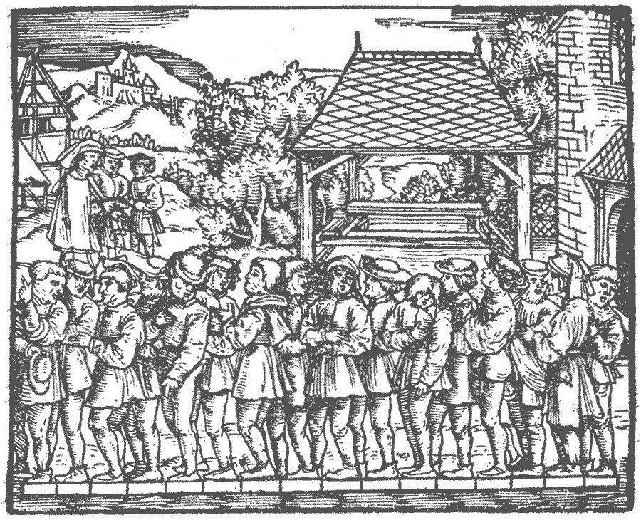
In his surveying manual Geometrei, the sixteenth-century mathematician and general Renaissance man Jakob Köbel offered a solution.
Stand at the door of a church on a Sunday and bid 16 men to stop, tall ones and small ones, as they happen to pass out when the service is finished; then make them put their feet one behind the other, and the length thus obtained shall be a right and lawful rod to measure and survey the land with, and the 16th part of it shall be the right and lawful foot.(Addy, 1925, p. 215)
Figure 3.5: Sixteen men line up their feet toe to heel to establish a surveying rod. Woodcut from Jakob Köbel’s Geometrei, first published in 1535 or 1536. Image from Addy (1925).
This practical procedure illustrates the logic of the mean. Any one foot (as in, the foot at the end of someone’s leg) is a bit different from any other. But if we take a bunch of them and figure out the average, we end up with an idealized foot that can be used as a more standardized and reliable unit of length than any one actual foot.
Note how the mean provides a model of the thing being measured. The sixteenth part of the measured rod—the idealized average “foot”—will not necessarily be the same as any of the individual feet from which it was calculated. The mean represents an ideal, not the actual. This is a powerful and useful thing. We can use the ideal foot without having to deal with all the individual idiosyncratic feet. But if we rely on ideals and neglect reality, we can get into another kind of trouble.
This becomes most obvious when the mean is used to describe and understand people. (Not just their feet.) Belgian astronomer, statistician, and pioneering sociologist Adolphe Quetelet adopted statistical techniques like the average to understand human and social data. In his 1846 book Letters on the Theory of Probabilities, as Applied to the Moral and Political Sciences, Quetelet examined the chest circumference measurements of more than 5,000 Scottish soldiers. He treated each soldier’s distance from the mean like an astronomer treated an observation’s distance from the true position of a star: as error (Gallagher, 2020). The mean represented the “true” soldier; actual soldiers were imperfect variations. Quetelet called this abstraction l’homme moyen, the average man. He saw in l’homme moyen the possibility of the same kind of harmonious proportion in health, beauty, and moral balance that the Pythagoreans found in music. An individual combining all of the average man’s qualities would represent “everything grand, beautiful, and good” and resemble a “type of perfection” (Quetelet, 1835, pp. 274–276).
Quetelet acknowledged, however, that this perfect identity could “scarcely be realized.” No one person can be average in every respect, and statistical findings from the masses should not be mechanically applied to individuals. A doctor should not merely treat every patient as if they were average but rather consider each individually (Quetelet, 1835, pp. 267–269).
The French modernist architect Le Corbusier did not allow any such reservations to constrain his own work. In designing buildings and urban spaces, Corbusier calculated people’s requirements for air, heat, light, and space, turning statistical abstractions and quantitative assumptions into blueprints for reality. Real people, as opposed to statistical aggregates, want their living spaces to do more than satisfy minimum physical requirements. They cook, work, socialize, gossip, relax, and make a place their own. But Le Corbusier brushed this aside: “Each man will live in an ordered relation to the whole.” No need to worry about individual wants, hopes, desires, because “human happiness already exists expressed in terms of numbers, of mathematics, of properly calculated designs” (Scott, 1998, pp. 112–113).
The reason I bring all this up here is to show that the mean is a simple and powerful tool, but we should not let its mathematical elegance lull us into forgetting that we are dealing with a deliberately simplified statistical summary rather than a direct representation of reality.
Calculating the mean
Ok, history lesson over. Let’s talk more about the math. Again, when we want to calculate the mean, all we do is sum the scores and then divide by the number of scores. (Since we’re doing real math here, the mean only works with quantitative data; a mean cannot be computed for categorical data.)
\[ \mu = \frac{\Sigma X}{N} \tag{3.1}\]
\[ M = \frac{\Sigma X}{n} \tag{3.2}\]
The \(\Sigma\) symbol tells us to add, and \(X\) represents each score. The other symbols differ depending on whether we’re talking about a sample or a population. For a population (Equation 3.1), we call the mean \(\mu\) and divide by uppercase \(N\), the number of individuals in the population. For a sample (Equation 3.2), we call the mean \(M\) and divide by lowercase \(n\), the number of observations in the sample. (Sometimes statisticians refer to the mean as \(\bar{X}\) (“x bar”). But social scientists generally use this \(\mu\) or \(M\) notation, so, with apologies to real statisticians, that’s what we’re going to use for our purposes.)
Why is this such an elegant and effective statistic? In our historical tour we encountered the idea of measurement errors, as when an astronomer might measure an angle slightly too low today and slightly too high tomorrow. And we also mentioned another kind of variability, as when some soldiers’ chest circumferences are bigger than average and some are smaller than average. Let me now use the more neutral term deviations.
A deviation is the difference between a score and some reference point, keeping track of direction. Here we can think about deviations from the mean. A score \(X\) above the mean has a positive deviation, while a score below it has a negative deviation. We can express the difference as \(X - M\). If we calculate the deviation for every score and then add them up, we always get the same answer: \(\Sigma(X - M) = 0\). This is what is special about the mean. It is the one reference point around which the signed deviations sum to zero.
Here’s a sort of visual, physical way of thinking about the average. Picture the kind of block histogram we mentioned in the previous chapter, with scores as boxes piled up on the x axis categories. And picture the x axis itself as a balance beam, perched on top of a pivot. The mean is the point along the x axis where scores are “balanced,” with the same “weight” on either side. The weight in the analogy refers to deviations: the total of the deviations below the mean are equal to the total of deviations above it.
Activity 3.2: The mean as a balance point
Stepped balance-beam demonstration. Five observations balance at their mean of 5. Their signed deviations sum to zero; moving the pivot or adding a new observation tips the beam until the pivot moves to the new mean.
How does this balancing act work? \(\Sigma X\) lumps all the observed scores into one total. Dividing that total by \(n\) shares it equally among the \(n\) observations. Imagine a bunch of people holding identical buckets containing different amounts of water (\(X\)). Some people’s buckets are almost filled to the brim, some people’s are almost empty. We have them all dump their water into one big tank (\(\Sigma X\)), and then share it back out equally (divide by \(n\)). Now everyone has exactly the same amount in their bucket (the average amount, \(M\)). The extra water in some buckets is exactly matched by the shortfall in others; the deviations balance.
Put mathematically, \(M=\frac{\Sigma X}{n}\) rearranges to \(nM=\Sigma X\). If we replace every observed score with the mean (\(nM\)) we get the same total (\(\Sigma X\)).
Comparing the three measures
Now we’ve explored the ins and outs of three measures of central tendency: the mode describes the most frequent score (or scores); the median orders the observations and divides them in half; the mean balances their values. When we can compute all three measures for a quantitative distribution, we might find that they pretty much agree, or that they diverge.
To see why, let’s start with an extreme example. Suppose we stand on a street corner and ask the people passing by their incomes. For some reason, they agree to tell us, and we list the first seven answers below.
We can locate the median right in the middle of the ordered incomes at $50,000. We can also calculate the mean by adding up all the values and dividing by 7. At this point, we’d find that it’s the same as the median, $50,000.
But the next person who walks by happens to be real estate tycoon Mr. Monopoly, with an annual income of a billion dollars.4 Now our data look like this:
If we recalculate the median, we find that it hasn’t budged much. It’s $52,500, halfway between the fourth and fifth values. As we’ve seen, the median depends primarily on position. Four incomes fall on either side of it. It doesn’t matter too much what the values at either end of the distribution are. Once Mr. Monopoly is at the upper end, his income could be one hundred thousand dollars or ten billion dollars; the median would be the same either way.
If we recalculate the mean, however, we find that it shoots up to around $125 million. The reason is that the mean balances all the deviations, and an extreme deviation requires the mean to move to accommodate it. So now exactly what Mr. Monopoly’s income is matters, and the farther it is from all the other observations, the more it pulls the mean in that direction. (To see this in action, go back to the mean balance beam and add a box close to the mean, then remove it and add one far away. Which one moves the balance point more?)
Obviously, this is an intentionally contrived example, but this is a genuine issue for researchers who are interested in income distributions. U.S. household income forms a positively skewed distribution. A relatively small number of households have extremely high incomes, while most have much lower incomes. For census data from 2024, the median and mean diverge by almost $40,000 (see Figure 3.6). Our choice of which to report or focus on can give quite a different impression of the “typical” household’s income.
Figure 3.6: Distribution of U.S. household income in 2024, with mean and median markers. Histogram bars represent $5,000 bins, except for the final striped bar which combines all households with incomes of $200,000 or more (16% of households). Data source: U.S. Census Bureau.
Histogram of U.S. household income with mean and median markers.
To take another example, we pointed out the bimodality of the tone-identification data from earlier in the chapter. But that distribution is also a bit skewed. The two peaks are not exactly the same height; the whole distribution is a bit more clustered at the lower-performing end, and skewed a bit by the smaller number of high performers. The median remains near the upper edge of the larger, lower-performing cluster, while the mean is pulled farther toward the space between the two peaks. Arguably, for these data, any one measure of central tendency on its own doesn’t tell the complete story of the distribution’s shape.
Figure 3.7: Distribution of tone-identification performance with the median and mean estimated from the grouped data. Recreated from Chubb et al. (2013), Figure 6.
Histogram of proportion correct for 275 listeners, with an estimated median of 0.62 and mean of 0.67. The distribution has peaks near chance performance at 0.5 and near perfect performance at 1.0.
Stepping back from real data and looking instead at generic distribution curves, we can watch how those three kinds of center respond to changes in normality, skew, and bimodality.
Activity 3.3: Watch the center change
A distribution changes from one symmetrical peak, where the mode, median, and mean coincide, through positive skew, where the mean lies farthest into the tail, back through symmetry into negative skew, and finally into two symmetrical peaks, where the mean and median lie in the valley between the modes.
Summary
Each measure of central tendency we’ve covered has pros and cons. The mode works with any variable type and can reveal more than one peak, but it can be less useful when the data is widely scattered and no single value is particularly representative. The median divides ordered data at the 50th percentile and is less influenced by outliers than the mean, but it ignores how far observations fall from that middle. The mean balances all the numeric values, making it especially useful for the analyses we’ll meet later, but it requires quantitative data and can be shifted more substantially by outliers. For reasonably symmetrical, single-peaked quantitative data, all three measures of central tendency often point to roughly the same place. When they don’t, the difference tells us something about the shape of the distribution.
Moving forward, the mean will be our measure of choice, because we’ll most often be dealing with quantitative data where the mean can acknowledge every data point. And as we’ll see, part of its value to us is in those deviations which it balances. We won’t overlook them; in fact, they’ll be central to much of what we end up doing. The mean offers us a model of a world in which everyone is identical; we could replace Köbel’s sixteen churchgoers with sixteen stand-ins, identical mannequins whose feet were all exactly average, and end up with the same answer for the length of the rod. That’s useful. But if shoes only came in one size, “average,” a lot of people would be left uncomfortable. In the real world, things do deviate from the mean. This kind of variability is worth quantifying, which is what we’ll turn to in the next chapter.
Learning Checks
0 of 6
1
For the scores 90, 90, 85, 80, and 0, which measure of central
tendency is largest?
Answer
Mode
Explanation
The mode is 90, the median is 85, and the mean is 69.
2
A sample of 5 scores has a total of \(\Sigma X = 40\). What is its mean?
Hint
For a sample, start with \(M = \Sigma X /
n\).
Answer
8
Explanation
Dividing the total by the sample size gives \(M = 40/5 = 8\). The letter \(M\) and lowercase \(n\) refer to a sample.
3
What is always true of the signed deviations from the mean?
Answer
They sum to zero
Explanation
The negative and positive deviations balance in total, so their
signed sum is zero. They do not need to be equal in number or cancel
one-for-one.
4
A survey asks commuters to choose their main way of traveling to
campus: walking, bicycle, bus, subway, or car. Which measure of central
tendency can be reported without imposing an arbitrary order on those
categories?
Answer
Mode
Explanation
The categories can be counted but have no inherent order or numerical
distance. So we can identify the most common response, but a median or
mean would require information the variable does not contain.
5
A university surveys students’ one-way commute times. The
distribution is strongly right-skewed because a few students have
extremely long trips. If the goal is to describe a typical student’s
commute, which report would be most useful?
Answer
The median, along with the shape of the distribution
Explanation
Commute time is quantitative, so all three measures can in principle
be calculated. But a few very long trips pull the mean into the right
tail. The median better describes the middle of the ordered commute
times, while the shape shows the long tail that any single number would
hide. The mean might still be useful for another purpose; the goal
matters too.
6
Which measure of central tendency guarantees that at least half of
the observations have values at or below it?
Answer
Median
Explanation
The median is defined by its position in the ordered data. At least
half the observations must be at or below it, so no more than half can
be strictly above it. The mean and mode offer no such guarantee: for
\(0, 1, 1\), two scores are above the
mean; for \(0, 0, 1, 2, 3\), three
scores are above the mode.
Bernoulli, D. (1961). The most probable choice between several discrepant observations and the formation therefrom of the most likely induction (C. G. Allen, Tran.). Biometrika, 48(1–2), 3–18. https://doi.org/10.1093/biomet/48.1-2.3
Chubb, C., Dickson, C. A., Dean, T., Fagan, C., Mann, D. S., Wright, C. E., Guan, M., Silva, A. E., Gregersen, P. K., & Kowalsky, E. (2013). Bimodal distribution of performance in discriminating major/minor modes. The Journal of the Acoustical Society of America, 134(4), 3067–3078. https://doi.org/10.1121/1.4816546
Daniel Bernoulli was the nephew of Jacob Bernoulli, who we’ll run into in Chapter 6.↩︎
The flattery may have been strategic, since Bernoulli was in fact aiming to persuade astronomers of the limitations of the mean.↩︎
For what it’s worth, Forbes actually estimated that Mr. Monopoly, a.k.a. Rich Uncle Pennybags, had a net worth of $7.1 billion back in a 2006 article, and later claimed that he lost it all in the 2007 subprime mortgage crash.↩︎