In the previous chapter, we used the normal distribution to determine the probability of seeing individual scores within a given range. But researchers usually collect a sample and summarize its scores with a statistic, like the mean. In Chapter 4, we saw that sample means vary because of sampling error, even though their errors balance out in the long run. Now we’ll ask how widely those means vary, and which results would be surprising.
The Quincunx
Before we proceed, take a moment to enjoy this little toy. (It’s a digital version of a real thing you can buy and keep on your desk to turn to in moments of boredom.)
ActivityThe Quincunx
A Galton board: balls fall through twelve rows of pegs, bouncing left or right at random at each peg, and pile up in bins at the bottom, forming a bell-shaped distribution.
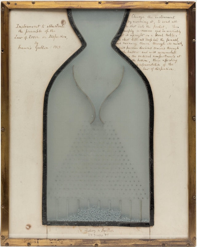
It’s called a Galton board, after Francis Galton, who developed it in the 1870s. (Galton also called it the Quincunx, meaning five points, as in the arrangement of groups of pegs.) The physical version is a little box with a clear front, rows of pegs, and lots of little balls (originally lead shot, like from shotgun pellets; ammunition manufacturers by this time were able to make the precise, uniform spheres that the demonstration requires).
As Galton inscribed on the original device, when set upright on a level table, “the shot will all drop into the funnel, and running thence through its mouth, will pursue devious courses through the harrow and will accumulate in the vertical compartments at the bottom, there affording a representation of the law of dispersion.”
By “law of dispersion,” Galton meant the tendency for the balls to end up in a predictable distribution—this is the same approximation of the normal distribution that Abraham de Moivre had discovered by thinking about a random process like flipping a coin many times. Each individual ball’s course is unpredictable, but the aggregate of all those “devious courses” looks roughly the same each time.1
In our digital board, each ball encounters twelve pegs, with an independent 50/50 chance of bouncing left or right at each one. To end up in the far-left slot, it has to bounce left every time. There is only one way for that to happen, just like there’s only one way to roll two dice and get a total of two. To land in the middle, a ball needs to take six lefts and six rights, and there are many different sequences that produce that mix, just like there are many ways to roll a seven with the pair of dice. We can’t predict any one ball’s path, but we can describe the pattern of possible landing places.
Sampling Error
Our purpose in this chapter is to understand how sampling from a population works—how we can quantify our trust in a sample as a fair representation of the population it came from. The Quincunx is a nice visual analogy for that process. Imagine that each ball is collecting a sample as it falls through the pegs. Each bounce supplies one observation; the final slot is the sample statistic, summarizing all twelve observations.
Let’s make the analogy more concrete with political opinion polling. Say support for Candidate Left and Candidate Right is split exactly 50/50 in the population. If we select twelve people at random, sampling error means we won’t necessarily find six supporters of each. Seven and five wouldn’t be too surprising. Or even 8 and 4. We could even get twelve supporters of Candidate Left, like a Quincunx ball bouncing left twelve times in a row. It’s unlikely, but not impossible. Repeat the poll over and over with different samples of twelve people each time and the results would form a distribution like the pile on the Galton board: results near 50% support would be common, while results near 0% or 100% would be rare.
Which poll would surprise you more?
Imagine two polls drawn at random from our evenly split population.
One asks 12 people, the other asks 1,200. Which would surprise you more
if three-quarters of its respondents supported Candidate Left? Why? Try
reasoning it out without calculating a probability.
Answer
The poll of 1,200. In a small sample, a few people can tip the
proportion a long way from 50/50. We’d expect a larger sample to come
closer to the population’s even split, so a result of 75% would be more
surprising.
Explanation
Neither result is impossible. The question is how much room chance
has to produce a lop-sided result when the population itself is evenly
split.
What if we had a sample of 100 people, rather than 12? In this case we’d expect something like 50 people to support each candidate, but it wouldn’t be too surprising if we saw something like 55/45. It would be surprising if we happened to get 100 people who all support Candidate Left. Now what if our sample size was 1,000? Or 1,000,000? Your intuition is probably telling you that the larger the sample, the more surprising an extremely lop-sided result would be.
This is, in effect, what the error bars on graphs of opinion poll results convey. (The precise math behind the margin of error is something we’ll talk more about in Chapter 10.) Figure 7.2 shows the results of two different polls conducted shortly before the 2000 U.S. presidential election, showing people’s support for the two main candidates, George W. Bush and Al Gore (support for other candidates was also surveyed, but their shares are not shown here). The error bars express uncertainty about population support around each estimate, allowing for sampling error.
Figure 7.2: Two final pre-election polls’ estimates of the popular vote in November 2000. Pew’s survey of 1,301 likely voters put Bush ahead, 49% to 47%, with a reported sampling margin of ±3 percentage points; Reuters/MSNBC’s tracking poll (conducted by Zogby, roughly 1,200 likely voters) put Gore ahead instead, 48% to 46%, with an illustrative sampling margin of about ±2.8 percentage points. Only the two leading candidates are shown. Sources: Pew Research Center, November 2–5, 2000; Reuters/MSNBC figures as tabulated in Walsh et al. (2009).2
Pew: Bush 49% (46% to 52%), Gore 47% (44% to 50%). Reuters/MSNBC: Bush 46% (43.2% to 48.8%), Gore 48% (45.2% to 50.8%). Bars show Pew’s published sampling margin and an illustrative simple-random-sampling margin for Reuters/MSNBC.
Notice that the two polls put different candidates ahead, but the gaps are small compared with the uncertainty around each estimate. As Pew put it, “the contest is so close that we cannot confidently predict the winner of the popular vote.” The actual popular vote was 47.9% for Bush and 48.4% for Gore, both within these polls’ margins of error. Sampling variability and people changing their minds or withholding opinions complicate what a poll can tell us.
Sampling Error with IQ Scores
The opinion poll results summarize categorical responses with a proportion. Now we’ll turn to quantitative data. What would happen if we could repeatedly take samples from a population and summarize each sample with a quantitative statistic like the mean?
Say we have a population with normally distributed IQ scores, a mean of 100, and a standard deviation of 15. We randomly collect ten observations, find their mean, then draw another ten and repeat. We did this kind of thing in Activity 4.3 in Chapter 4. There, we tracked the samples’ errors and saw their average approach zero. This time we’ll collect the means themselves into a block histogram, to see which occur most often and how widely they vary as they pile up.
Activity 7.1: Build the sampling distribution
Interactive pathway from an IQ population through samples to a distribution of sample means.
Notice how similar the final shape of the histogram of sample means in Activity 7.1 is to the shape of the balls at the bottom of the Quincunx. The process is different; instead of balls randomly bouncing off pegs, we are randomly selecting members of the population. But the reason for the outcome is similar: when we sample randomly from a population, there are lots of ways for a sample mean to be close to the true population mean, but few ways for it to be very far away.
The name for the kind of distribution we created is a distribution of sample means, or sampling distribution of the mean. And the predictability of its shape is the key insight that powers the inferential statistics we’ll begin using in the next chapter.
The Distribution of Sample Means
Technically the sampling distribution of the mean is the distribution of sample means obtained by selecting all possible samples of a given sample size \(n\) from a population. For the IQ distribution, we ended with 200 random samples, not every possible sample. As you might imagine, for any reasonably large population, there’s often a huge number of possible samples; for practical purposes, the number might be effectively infinite. We’ll return to this problem shortly, but we won’t let it stop us from demonstrating the fundamental principles now. We just need a small, manageable population, from which we can obtain all possible samples of a given size. Like, very small.
Suppose we have a population consisting of just four people. We’re interested in their height. We have one person 60 inches tall, one 62, one 64, and one 66.
Table 7.1: A frequency table showing the four heights in our population. There’s just one person of each height.
Height
\(f\)
60
1
62
1
64
1
66
1
We can describe some features of this population. Its mean is \(\mu = 63\) inches3, and its standard deviation is \(\sigma = 2.24\) inches.4
But remember, we’re not interested in individuals anymore. We’re interested in samples. So now we’re going to list every possible sample where \(n = 2\), meaning we have two observations in each sample. Table 7.2 lists every possible sample. \(X_1\) is the first score in the sample. \(X_2\) is the second score. And \(M\) is that sample’s mean. Note that for this to work, it is important that we’re sampling independently, meaning that the first observation in each sample does not affect the second. For this tiny population that means the same person can appear twice. The first row, for example, is the 60-inch person twice. Obviously the sample mean there is 60. The next sample consists of the 62-inch person and the 60-inch person, giving a mean of 61. And so on.
Table 7.2: All 16 possible samples of \(n = 2\) (with replacement) from the four heights.
Sample
\(X_1\)
\(X_2\)
\(M\)
1
60
60
60
2
62
60
61
3
64
60
62
4
66
60
63
5
60
62
61
6
62
62
62
7
64
62
63
8
66
62
64
9
60
64
62
10
62
64
63
11
64
64
64
12
66
64
65
13
60
66
63
14
62
66
64
15
64
66
65
16
66
66
66
In case the tables don’t make this process entirely clear, we can visualize the process of obtaining each sample and its mean step by step.
ActivityBuild every sample mean
Interactive pathway through all possible samples and sample means from four heights.
So for this tiny population, we have been able to exhaustively compile every possible sample mean for samples of size \(n = 2\)—something we could only approximate with the bigger IQ population and the 200 means we collected randomly. But you see the similar pattern? Again, sample means close to the true population mean are relatively common; sample means far from the true population mean are relatively uncommon.
This slightly tedious process has given us a new kind of population: the set of every sample mean. We can describe its characteristics just as we would for any other population.
We can, for example, figure out its mean. The mean of the distribution of sample means is called the expected value of the mean, \(\mu_M\). Its value should be obvious visually. It’s a symmetrical distribution and the peak is right on 63 inches, so that’s the mean. You can also calculate it by adding all 16 sample means and dividing by 16, the number of scores. Remember, 63 was the mean of the population as well, so the mean of the sampling distribution is equal to \(\mu\).
We can also calculate the standard deviation of the 16 means. The standard deviation of the sampling distribution is also called the standard error of the mean. The symbol for this is \(\sigma_M\). We can calculate it in the same way we did in Chapter 4, by putting all those values in a table, working out columns for deviations, the squared deviations, then using those to get the sum of squared deviations, the variance, and the standard deviation. Note that because we’re dealing with a population of sample means we use the population formula for variance, dividing \(SS\) by \(N\) (rather than \(n - 1\) for a sample).
Table 7.3: Every sample mean, its deviation from the mean of the sampling distribution, and its squared deviation. The sum of squared deviations is 40, giving a variance of 2.50 and a standard error of about 1.58.
Table of deviations and squared deviations for all 16 sample means, used to compute SS = 40, variance = 2.5, and standard deviation of about 1.58.
Lastly, because we know every possible mean, we can think about the probability of observing certain sample means from this distribution, just like we thought about the probabilities of obtaining certain scores from a regular population.
Sampling Distribution Probabilities
Look at the 16 possible samples of \(n =
2\) from our population of four heights. What proportion of those
samples have a mean of 63 inches? Enter a decimal.
Answer
0.25
Explanation
Each of the 16 samples in the table is equally likely. Four have a
mean of 63: (60, 66), (62, 64), (64, 62), and (66, 60). So the
probability is \(4/16 = .25\). We count
(60, 66) and (66, 60) separately because they put the first and second
observations in a different order. Some means occur more often than
others, so we can’t treat the seven possible mean values as equally
likely.
Figure 7.3: The highlighted blocks are every sample mean below 63.
Block histogram of the 16 sample means, with the blocks below 63---means of 60, 61, and 62, six blocks in all---highlighted.
\[ P(M < 63) = \frac{6}{16} = .375 \]
Figure 7.4: The highlighted blocks are the two most extreme sample means.
Block histogram of the 16 sample means, with the two most extreme blocks, 60 and 66, highlighted.
\[ P(M < 61 \text{ or } M > 65) = \frac{2}{16} = .125 \]
The Central Limit Theorem
The trouble with distributions of sample means is that it’s just not feasible in most realistic situations to obtain every possible sample of a given size for a population. Listing every possible sample worked for four people and samples of two. But imagine doing that for, say, all American voters. Even if we knew everyone’s scores, the number of possible samples would be astronomical. (Also, if we knew everyone’s scores, we wouldn’t need to sample anyway.)
Thankfully, some simple equations and a theorem can help. We can predict the sampling distribution’s characteristics without compiling every possible sample. Its center and variability follow from the population mean, population variability, and sample size, and the Central Limit Theorem tells us about its shape.5
Center: The Expected Value of the Mean
The center of the sampling distribution is simple: the average of all the sample means equals the population mean. This is because \(M\) is an unbiased statistic: some of the sample means are above the true population mean, some are below, and they balance out perfectly. So the expected value of the mean is exactly equal to the population mean:
\[\mu_M = \mu \tag{7.1}\]
For our four heights, both the population mean and the mean of all 16 sample means were 63. It wasn’t a coincidence! It reflects the sample mean’s lack of bias.
Variability: The Standard Error of the Mean
Unlike its center, the variability of the sampling distribution (its standard error, \(\sigma_M\)) is not equal to the population variability. Instead it is smaller, as a function of the sample size, \(n\).
\[\sigma_M = \frac{\sigma}{\sqrt{n}} \tag{7.2}\]
The numerator is the population standard deviation, \(\sigma\). So the larger the variability in the population, the larger the standard error of the mean. The denominator is the square root of the sample size. And so the larger our sample size, the smaller the standard error of the mean.
An algebraically equivalent form is useful if you have variance, \(\sigma^2\), rather than the standard deviation, \(\sigma\):
You can see how they are equivalent: \(\sigma^2\) is literally just \(\sigma\) squared, so \(\sqrt{\sigma^2}\) is the same as \(\sigma\).
Returning to our toy population of heights, we can figure out the standard error of the mean using just known population characteristics. Remember, we said the standard deviation of the population of four heights is \(\sigma = 2.24\). So if we put it into that equation, we get:
It’s the same answer as when we went through the full rigmarole of compiling all possible samples for that little population and computing their standard deviation manually! Plugging two numbers into an equation could have saved us a lot of work there.
Of course, the real value is applying the equation where we couldn’t compile all possible samples to double-check the answer. Let’s return to IQ scores and see how sample size affects the standard error. Because the IQ population is normal, we can use normal curves to show how its sampling distribution’s variability changes as we change \(n\); we’ll talk more about normality in the next section.
ActivitySee how sample size affects the standard error
Dashed normal population curve with mean 100 and standard deviation 15; a blue sampling distribution changes width as sample size varies from 2 to 30, on fixed axes.
Shape of the Sampling Distribution
It wasn’t a coincidence that the distribution of the Quincunx balls, IQ samples, and height sampling distribution all took on the same basic shape: approximately normal, with most values clustered in the middle with extreme values trailing off symmetrically on either side. (Okay, the heights sampling distribution was more of a triangle, because of the tiny population and sample size, but still in the same ballpark if you squint.) The Central Limit Theorem helps explain when we can expect a sampling distribution to be approximately normal.
If the population we’re sampling from is normally distributed, we’re good: its distribution of sample means will be normal, whatever the sample size. But even if the population is not normal, the distribution of means approaches normality as sample size increases. You’ll sometimes hear \(n = 30\) as a rule of thumb for when the distribution of means is “close enough” to normal. But there’s no magic threshold. For a nonnormal population, the distribution of means never becomes exactly normal; the approximation improves gradually, at a rate that depends on the population’s shape. Activity 7.2 lets us see that in action.
Activity 7.2: When do sample means look normal?
Interactive comparison of population shape and the resulting distribution of sample means.
The normality of the sampling distribution is important to establish, because if we can be confident that the distribution is normal (or close enough for practical purposes), we can then use \(z\)-scores and the unit normal table to calculate probabilities of observing sample means in particular ranges.
With our tiny population of four heights, we could count how many of the 16 possible sample means fell in a particular range. Six were below 63, for example, giving us \(P(M < 63) = 6/16 = .375\). But we usually can’t list every possible sample mean. Earlier, in Activity 7.1, we ended up with 200 sample means—not the entire sampling distribution, just a small random sample of means from it. Knowing the sampling distribution’s center and standard error tells us where the means are centered and how widely they vary. As long as its shape is normal, we can use the unit normal table from Chapter 6. (When a sampling distribution is only approximately normal, the table’s probabilities are correspondingly approximate.)
Among those 200 IQ sample means—obtained from samples of \(n = 10\) from a normal population with \(\mu = 100\) and \(\sigma = 15\)—it looked like means below 90 were pretty rare. Now we can work out how rare. Despite the small sample size, the sampling distribution is normal because the population is normal. It is centered on \(\mu_M = \mu = 100\). Its standard error is:
\[\sigma_M = \frac{15}{\sqrt{10}} \approx 4.74\]
To find where a sample mean of 90 falls in that distribution, we calculate a \(z\)-score. The calculation works just as it did for individual scores, except that we divide by the standard error of the mean rather than the standard deviation of individual scores:
That tells us that a mean of 90 is about 2.11 standard errors below the population mean. Looking up \(z = 2.11\) in the unit normal table, we find an area of \(.0174\) to the right. By symmetry, that’s also the area to the left of \(z = -2.11\). In other words:
\[P(M < 90) \approx .0174\]
Only about 1.7% of random samples of ten from this population would have a mean below 90. We didn’t have to collect all those samples and count their means to find that probability. We just needed to know the sampling distribution’s center, standard error, and normality. (As it happens, 4 of the 200 means we randomly generated were less than 90, so 2%. Pretty close to what the math predicts!)
This is the importance of the Central Limit Theorem. Even if a population isn’t normal, a sufficiently large sample can make its sampling distribution approximately normal, allowing us to use the normal curve’s areas to determine probabilities associated with sample means. In the next chapter, we’ll use these probabilities to start testing hypotheses.
Sampling People in Practice
So now we’ve seen a few examples of normality and predictability emerging from random sampling. We’re almost ready to apply these tools in the context of social science research. But first, let’s take a moment to consider how closely collecting data from people resembles the sampling in our demonstrations. The version of the Central Limit Theorem we’ve used assumes independent observations drawn from the same population distribution; applying it in practice requires those assumptions to be reasonable approximations.
Random Selection, Replacement, and Independence
First let’s define three terms. Random sampling is about how we choose observations: we use a chance procedure. Replacement is about whether someone or something already selected can be selected again within the same sample. Independence is about whether knowing one observation changes the probabilities for another.
In the demonstrations above, I sampled with replacement. This was most obvious with the small population of four heights: the 16 possible samples of \(n = 2\) included samples in which the same person appeared twice. To see why that mattered, let’s turn to another statistics textbook favorite: picking marbles out of a jar.
In The Art of Conjecturing, published in 1713, Jacob Bernoulli asked his reader to imagine an urn containing 5,000 pebbles, in some unknown ratio of white to black. By drawing pebbles repeatedly, someone who couldn’t see the contents could estimate that ratio from the proportion of white pebbles they observed (Bernoulli, 2006).
To keep things simple, imagine a jar with just 50 marbles, 40 blue and 10 white. We want to pick out two marbles, one after the other. If each marble is equally likely to be drawn, the probability of white on our first draw is \(P(\text{white})=10/50=.2\).
So far so simple. But what is the probability that a second draw will also be white? To answer that, we need to know a small but important procedural detail: did we put the first marble back, or leave it out?
If we sample with replacement, we put it back and mix the jar before drawing again. There are still 10 white marbles among 50, so the probability stays .2, whatever color we drew first. The draws are independent.
If we sample without replacement, we leave the first marble out. After drawing white, only 9 white marbles and 49 marbles in total remain, so the probability of another white is \(9/49 \approx .184\). After drawing blue, it would instead be \(10/49 \approx .204\). The draws are dependent: knowing the first result changes the probabilities for the second.
Both procedures are random, but only the first gives us independent draws. For people, choosing names by lottery from a complete population list works the same way. Without replacement, this produces a simple random sample: every possible set of \(n\) people has the same chance of being selected. Random doesn’t mean choosing whoever happens to be nearby, and it doesn’t require replacement.
Can We Treat People’s Scores as Independent?
Do you sense a potential problem here? Social scientists study people, who aren’t like marbles we can put back into a jar. Social scientists generally collect data from each participant once. Strictly speaking, this makes successive selections dependent, as it is sampling without replacement. But like the (non)normality of the sampling distribution, the problem is a matter of degree. What matters is the fraction sampled across the whole sample, not just the tiny change after the first draw.
If the sample is only a small fraction of the population, removing those people barely changes who is available. Selecting 100 people randomly from a population of 10,000 removes just 1% of the population in total. The resulting dependence is weak enough that treating the observations as independent is a good enough approximation. If we sampled a much bigger chunk of those 10,000 people, say 5,000, sampling without replacement would noticeably reduce the variability of the sampling distribution. The usual formula, \(\sigma_M=\sigma/\sqrt{n}\), would fail to account for that reduction and would therefore overstate the standard error.6
Still, would allowing someone to participate twice—sampling with replacement—be better? Usually not. Dependence can come in other forms. In our height example, sampling with replacement gives independent draws of the heights. But for other kinds of research, participating in a study can change someone: they may learn the task or remember the questions. Selecting them again doesn’t make them naive to the procedure, so their second score would not be independent of their first. In that case, sampling without replacement is better, even if it introduces a small amount of dependence across the sample.
Dependence can also arise among different people. Responses from members of one household may share influences; pupils in one classroom share a teacher and learning environment. An opinion poll sampling whole households could underestimate the standard error if it treated all their responses as independent. Studies that do things like that can still be useful, but their analysis needs to account for dependence. (Sometimes we deliberately measure people before and after a treatment, for example. Those paired responses are related, so we need an analysis that accounts for that, which we’ll see in Chapter 13.)
Which Population Are We Sampling?
Lastly, we should point out that even if we are appropriately ensuring independence in a statistical sense, we still need to be careful that our sample is a fair representation of the population we are trying to make inferences about. Remember Köbel’s proposal in Chapter 3 to define a foot by averaging the feet of sixteen men leaving church? Suppose we wanted to estimate the average foot length of the town’s adult men. A simple random sample could happen to include some unusually large feet. That’s sampling error; across repeated random samples, high and low estimates would balance around those men’s mean.
Now imagine trying Köbel’s procedure outside the locker room of the New York Knicks basketball team. We’d probably get a much larger average foot size. Or imagine lining up my kid’s second-grade class: we’d get a much smaller answer. Both procedures systematically favor feet unlike those of the town’s complete population of adult men: that’s selection bias. Even choosing randomly within those niche groups of basketball players or kids wouldn’t fix it.
Somewhat more subtly, say we recruit people for an opinion poll by randomly dialing phone numbers listed in a database. People who answer and agree to tell us their thoughts may differ from those who don’t, and not everyone in the population might have a number in our database. Those are coverage and nonresponse problems. Alternatively, recruiting whoever walks past, volunteers online, or participates for course credit gives us a convenience sample, rather than a simple random sample of the general population. (Arguably Köbel’s churchgoers were a convenience sample; the men who attended church might not represent the broader population.)
Convenience sampling can be perfectly acceptable for some research questions, and the Central Limit Theorem still applies if treating its scores as independent observations from a common population distribution is reasonable and the sample is large enough. But generalizing beyond the population we actually sampled needs a separate argument, and increasing the sample size can’t fix a procedure that systematically produces biased data.
Summary
So to repeat and summarize, assuming we are independently sampling from a population, the distribution of sample means has an expected value, \(\mu_M\), equal to \(\mu\). It has a standard deviation, or standard error of the mean, of \(\sigma / \sqrt{n}\). Its shape is exactly normal at every \(n\) when the population is normal. For a nonnormal population, its standardized shape approaches normality gradually as \(n\) increases, at a rate that depends on the shape of the population. \(n = 30\) is often a useful convention, but it is not a magical cutoff. And we need to consider whether treating our observations as independent is reasonable, and whether the population we sampled is the one we want to make inferences about. These insights power much of the inferential statistics that we’ll move on to later, because they allow us to reason about the probability of sample statistics rather than only individual scores.
Learning Checks
0 of 12
1
In the IQ demonstration, we collected samples of \(n = 10\) and built a block histogram of
sample means. What does each blue block in that histogram represent?
Answer
The mean of one sample of ten scores.
Explanation
Each blue block marks one sample mean. The sample size tells us how
many observations went into that mean, not how many means we have
collected.
2
A sample has \(M = 104\), from a
population with \(\mu = 100\). What
does the difference of 4 tell us?
Answer
This sample’s sampling error is 4.
Explanation
\(M - \mu = 4\) is the error for
this particular sample. The standard error describes how widely means
vary across repeated samples. One sample mean being too high does not
mean the sampling procedure systematically gives us estimates that are
too high.
3
We draw independent observations from a population with \(\mu = 40\) and \(\sigma = 10\). What does it mean to say
that the sample mean is unbiased?
Answer
The mean of all possible sample means equals 40.
Explanation
\(\mu_M = \mu = 40\). Some sample
means are above 40 and some are below, but they balance out. The average
of all possible sample means equals the population mean, even if the
population is not normal.
4
We collect 200 sample means in a simulation, then keep going until we
have one million. Each sample still contains five observations from the
same population. What should we expect?
Answer
A histogram that more closely follows the predicted sampling
distribution.
Explanation
With more sample means, the random bumps in the histogram tend to
settle down, revealing the sampling distribution more clearly. But \(n\) is still 5: we have more samples, not
more observations in each sample. The population and sample size haven’t
changed, so neither have the predicted center, standard error, or
shape.
5
Independent observations are drawn from a population with variance
\(\sigma^2 = 100\). What is the
standard error of the mean for samples of \(n
= 25\)?
Hint
Find the population standard deviation before using \(\sigma_M = \sigma/\sqrt{n}\).
Answer
2
Explanation
\(\sigma = \sqrt{100} = 10\), so
\(\sigma_M = 10/\sqrt{25} = 2\). The
individual scores have a standard deviation of 10; the sample means have
a standard deviation of 2.
6
With independent observations from the same population, samples of
\(n = 25\) give a standard error of 2.
What sample size would reduce the standard error to 1?
Answer
100
Explanation
Halving \(\sigma/\sqrt{n}\) requires
doubling \(\sqrt{n}\), so we need four
times as many observations per sample: \(4
\times 25 = 100\). Doubling the sample size would not halve the
standard error.
7
We draw samples of five independent observations from a normally
distributed population. What is the shape of the distribution of all
possible sample means?
Answer
Exactly normal.
Explanation
When the population is normal, the distribution of means is normal at
every sample size. A histogram of only a few simulated means can still
look lumpy.
8
Once sample size reaches \(n = 30\),
a nonnormal sampling distribution becomes exactly normal.
Answer
False
Explanation
The distribution of means becomes closer to normal gradually as
sample size increases. Thirty is sometimes a useful rule of thumb, but
it isn’t a magical cutoff. How large a sample we need depends on the
shape of the population we’re sampling from.
9
A researcher puts every student’s name in a hat, mixes it, and draws
20 different names without putting any back. Which description fits the
selection of students?
Answer
Random, with dependent selections.
Explanation
This is a simple random sample without replacement. Each selected
name changes who remains available, so the selections are dependent.
Replacement allows repeat selections in our toy examples; randomness
does not require it.
10
We select a simple random sample from a population without
replacement. When can we still use \(\sigma_M
= \sigma/\sqrt{n}\) as a useful approximation of the standard
error of the mean?
Answer
When the sample includes only a small fraction of the population.
Explanation
If we select only a small fraction of the population, removing those
people barely changes who is available. We can treat the observations as
approximately independent. If we sample most of the population, sampling
without replacement reduces how widely the sample means vary, so \(\sigma/\sqrt{n}\) overstates the standard
error.
11
A poll samples whole households. Because every respondent is a
different person, it is reasonable to treat all their responses as
independent.
Answer
False
Explanation
People in the same household may share influences. Treating those
related responses as independent can underestimate the standard error.
Measuring each person only once doesn’t rule out these shared
influences.
12
A researcher wants to estimate how many hours adults sleep on
average, but recruits volunteers from an Intro Psych class. Would
recruiting more students in the same way fix the problem of selection
bias?
Answer
No, the volunteers may still differ from the broader population of
adults.
Explanation
A larger sample can have a smaller standard error, but these students
may still have different sleeping habits from the broader population of
adults. Increasing the sample size can’t fix a procedure that
systematically produces biased data.
Bernoulli, J. (2006). The art of conjecturing, together with “letter to a friend on sets in court tennis” (E. D. Sylla, Tran.). Johns Hopkins University Press.
Walsh, E., Dolfin, S., & DiNardo, J. (2009). Lies, damn lies, and pre-election polling. American Economic Review, 99(2), 316–322. https://doi.org/10.1257/aer.99.2.316
The exact distribution is binomial; the normal curve approximates its shape, just as in de Moivre’s coin-toss example in Chapter 6.↩︎
Before allocating undecided voters, Pew had Bush at 45%, Gore 43%, Nader 4%, Buchanan less than 1%, and 8% undecided; the headline estimates shown here allocate those undecided voters. The Pew bars use the published sampling margin. The Reuters/MSNBC margin was not supplied in the source used here; the ±2.8 points shown is an illustrative guess based on the sample size. Neither poll’s bars include uncertainty from allocating undecided voters or subsequent changes in voting intentions.↩︎
The equations for the center and variability apply under the conditions we’re operating under here—specifically, independent observations drawn from a population with a finite mean and variance. There are situations where this doesn’t hold, but they are beyond the scope of this book.↩︎
There are methods for adjusting for this, but that’s beyond the scope of this book.↩︎